Every once in awhile, a friend or acquaintance will read a bunch of my posts and say, “Hey, I was stalking your blog.” I always thought this was strange because my blog is public. If I didn’t want people to read it, it would be on my hard drive, not the internet. Then I started to wonder if the feeling that they were “stalking” my blog came from the design.
Instead of a design that says, “Hey, this is someone’s personal blog. Maybe they don’t totally realize this is online and anyone can read it?” I would like a design that says, “This is the website of a speculative fiction author and freelancer, and you can read what they have to say about some stuff.” These roles, along with enjoyment of blogging and web design, are why I have this website. Yet, it doesn’t do a good job of expressing them, for good reasons as well as bad ones.
Hint: they’re the same reasons. They boil down to the fact that, although I’ve been designing website for 20 years, I didn’t design this site myself because I needed to avoid waffling. And maybe even waffles.
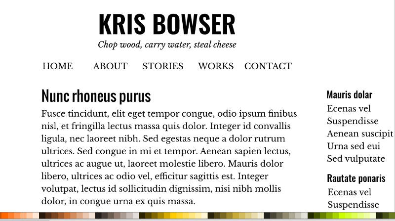
What’s wrong with the current design? In some respects, not much. It’s readable, for sure, and with the exception of the subheadings, (H2, H3, H4, etc) I like the typography. I even like the “Bleached Landscape” color scheme, which I picked in defiance of my own attitude that if something isn’t dark-colored, it’s deeply uncool.
However, the design is also decidedly personal blog-like. It also has a slightly dated look to it, which honestly, is part of the reason I picked it. It reminds me of a nicely- designed Livejournal with some cool details. There’s nothing actually wrong with it because I don’t consider not following current trends to be a wrong. What matters is that it doesn’t match my current aesthetic well enough, and I didn’t design it myself (aside from some tweaks over the years, such as the background from the cover of Spirit Notes Fading).
There are plenty of pre-made WordPress themes I could choose from to change the blog vibe to something more professional, if that’s what I wanted to do. But since web and graphic design are two of the areas I do freelance work in, it would be preferable to have a website of my own design. And since I’m also a speculative fiction writer, that is something I would also like the design to express.
One question I’ve been wrestling with: to what extent do I want to adopt the common tokens of author websites, such as typewriter-style headings and bookish body text? Do I need to bludgeon visitors over the head with my absolute writerly-ness, when everyone else who has a blog is also a writer? Many fiction authors’ websites appear designed to convey that they aren’t just some blogger, but a real writer. A writer’s writer.
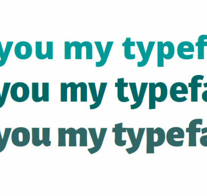
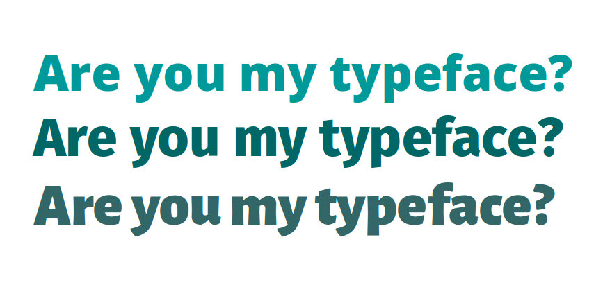
As far as I’m concerned, typography is the second step of a web or graphic design project, after brainstorming. I always aim to make the typography and layout do as much of the heavy lifting as possible before I start adding color or anything else that isn’t absolutely crucial. And that’s where I am now. It’s a bit of a background project at the moment, but since I look at typography the way other people look at cat pictures, it’s been on my mind.
You only get three typefaces per project. At least, that’s the conventional wisdom. It’s the “Show don’t tell” of graphic design. Like any common and seemingly wise platitude, you can find a number of places where people break the rule, for good reasons and bad. I won’t be breaking the rule in the redesign because the rule will serve my purposes.
My three typefaces can say any number of things, on their own or in combination, by their sizes, spacing, positioning, coloring, bolding, italicizing, proselytizing, and jazzercising. Will they convey a mood that is academic, provocative, sarcastic, persuasive, informative, intellectual, surreal, silly, serious, dark, weird, perfectionist, or diy-to-a-fault?
Furthermore, am I correct in thinking I’m the things I think I am? And even if I am those things, do I want to express them in an on-the-nose sort of way, or do I want to put a twist on them? And in any case, how many of these things can even be expressed through typography?
And that’s the story of how typography can pave the path right into an existential swamp of anxiety.